HOW MIGHT WE RESTRUCTURE THE INTERFACE FOR USERS TO EASILY NAVIGATE AND MANAGE THEIR TASKS?
Feb - May 2024
12 weeks
Figma, Slack
Dojj
AUTOMATED TASK MANAGEMENT
MY ROLE
MY TEAM
TIMELINE
TOOLS

UX
UX
UX
UX
UX
UX
UI
PM
QA


Dojj is an AI-powered, one-click solution for task management, dedicated to founders and team leaders. "Easily turn your emails and messages into actionable tasks."
From the testing, we saw that we needed to reiterate a more intuitive and usable product.
To make the app more usable, there were needed screens and modals to connect each screen.
We were able to see where we needed to fill the gaps and features to make it a workable product.

From your email and messages to your task board
Fortifying the foundational features of the Start Up App
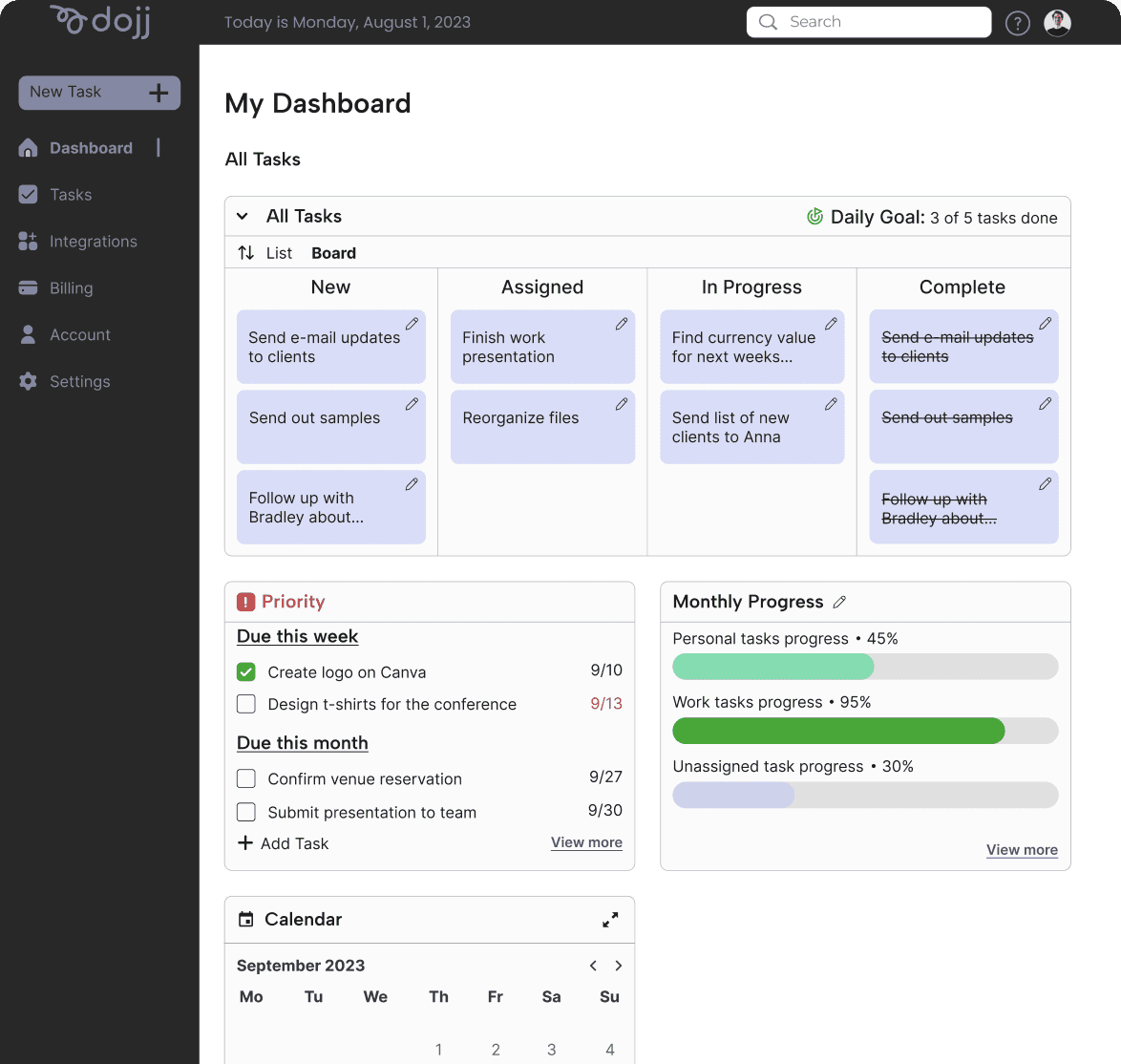
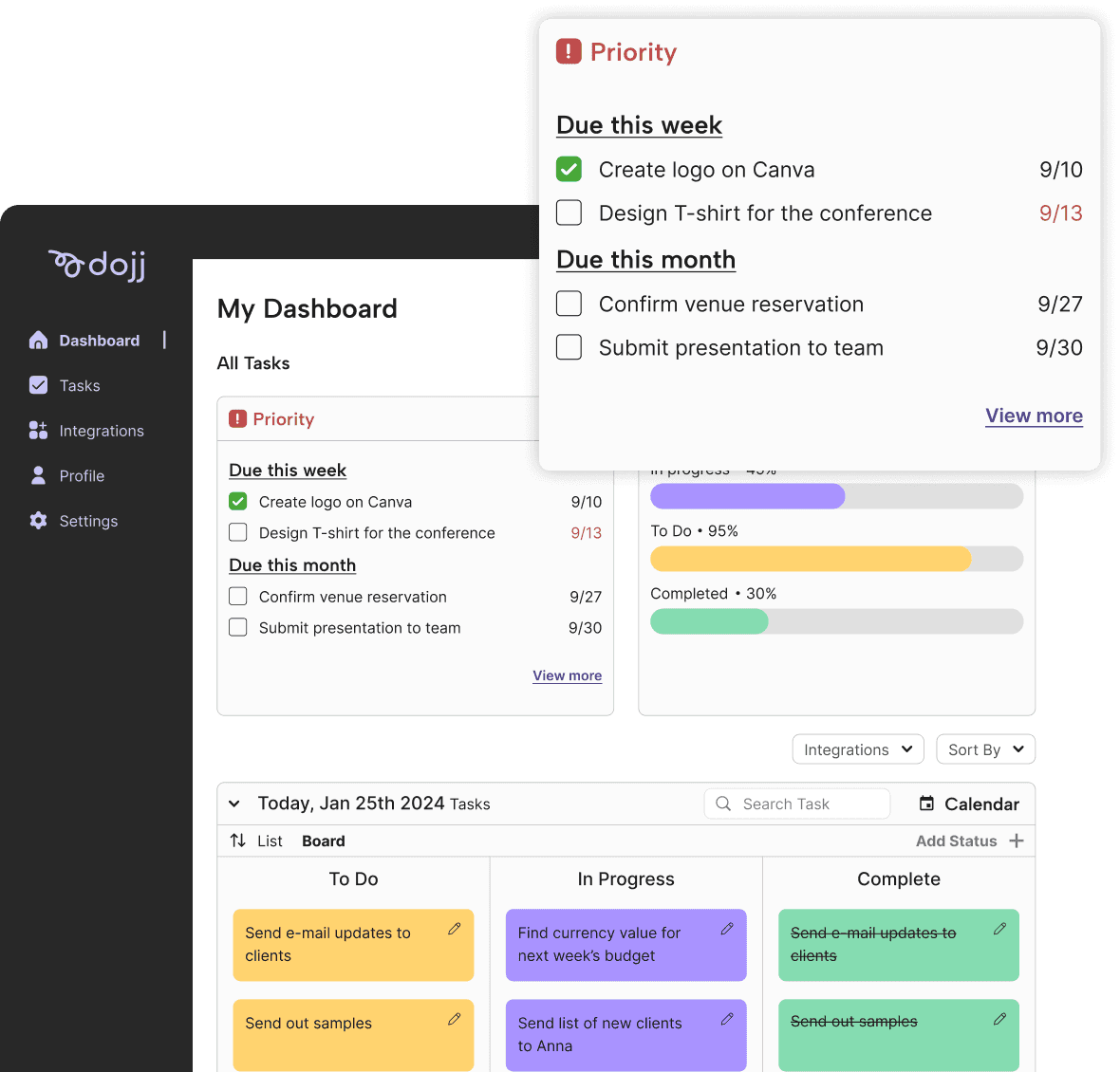
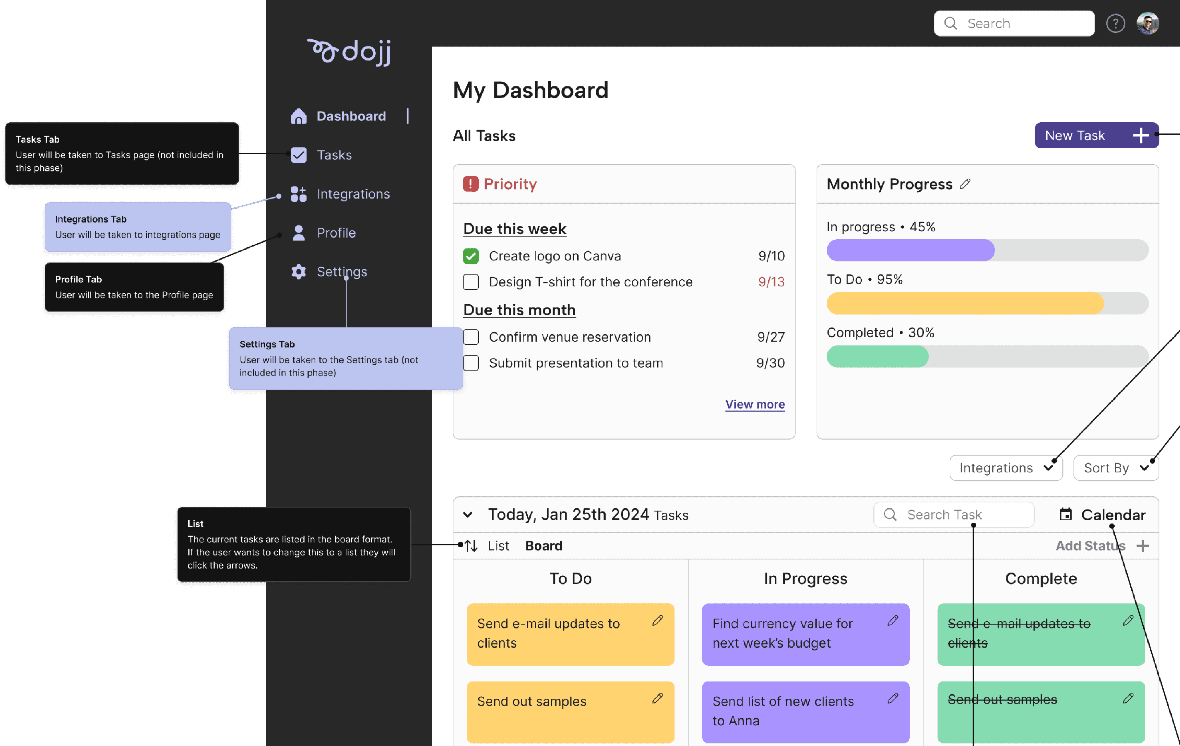
Keep up with your Tasks by Hierarchy in your Dashboard
Creating a usable experience with cards and modals
Knowing our users from their standpoint with our product
To find how we might improve upon the current designs, we conducted usability tests by creating prototypes to find the pain points and strengths.
Poor documentation
Lack of user flow screens
Lack of client vision application
Startup Founder
With a small team, Alex didn’t have the people to delegate work. Therefore, he needed a quick fix on how to streamline all the tasks his team needs his approval on.
Organize and assign tasks from emails and team chats effortlessly.
Reduce manual effort in task management.
Enhance team collaboration and productivity.
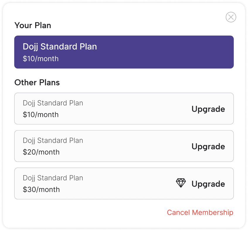
Billings screen tested well
Task flow of adding tasks
KEY FINDINGS
Current App Feedback
Developer Handoffs


Target Audience
User Goals
Painpoints
User Flow
REDESIGN
User Journey
Brand Guide
CAPITAL LETTERS
LOWERCASE LETTERS
Strengths

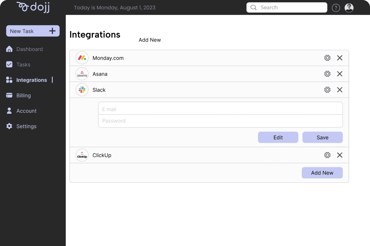
Integrations
Billings
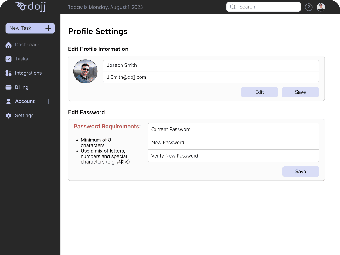
Profile
Login/Sign Up
Dashboard
With the lack of hierarchy, the communication with the tasks are not clear and confusing.
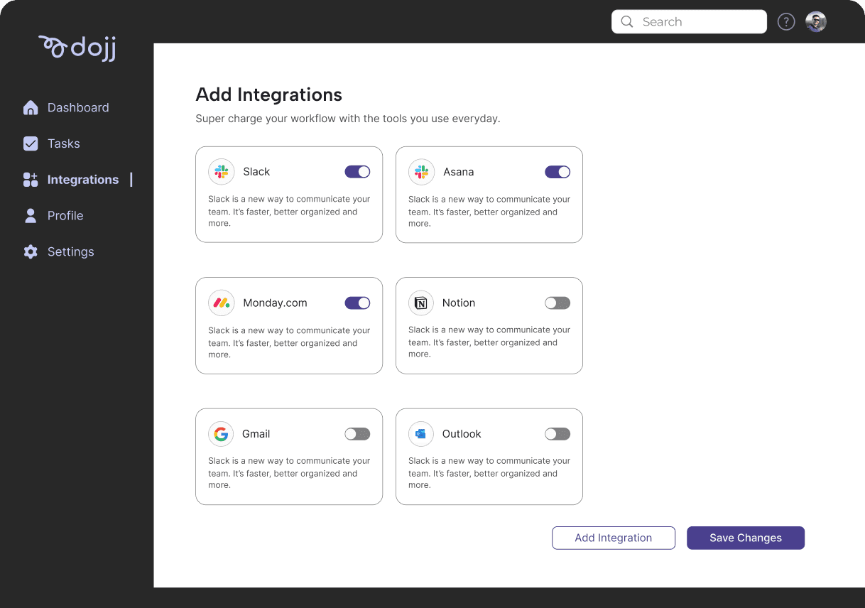
Usability with integrating their emails and programs were confusing users.
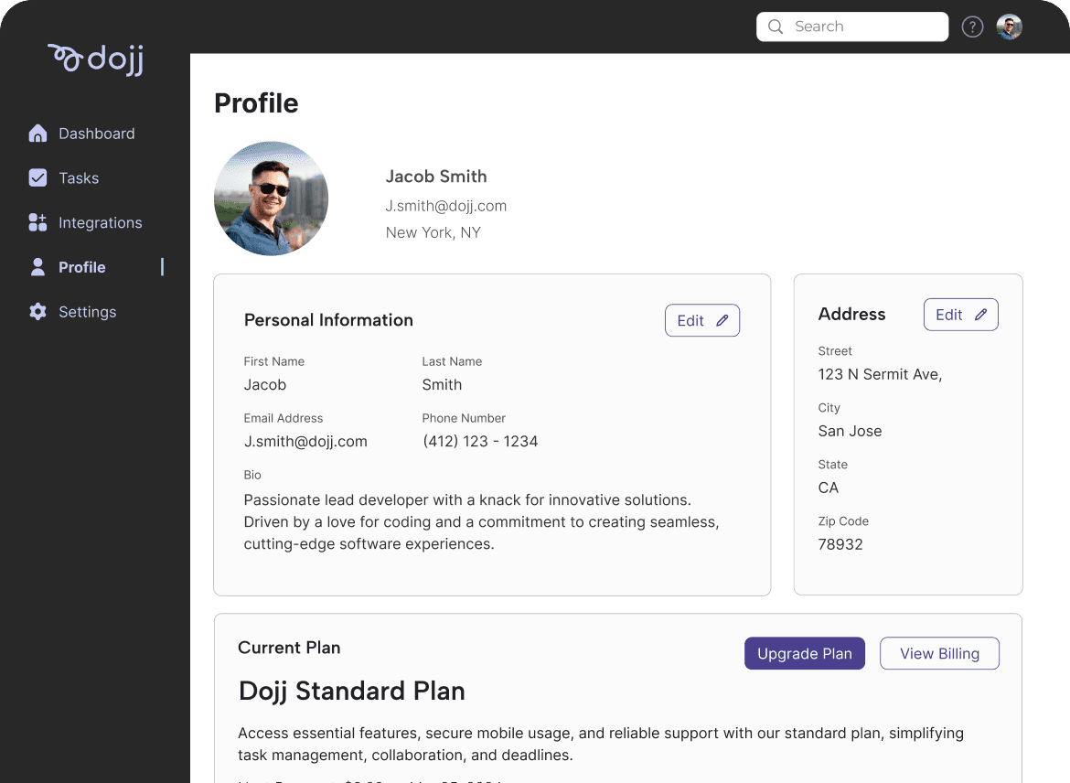
There seemed to be a lack of essential information most users are searching for in their profile.
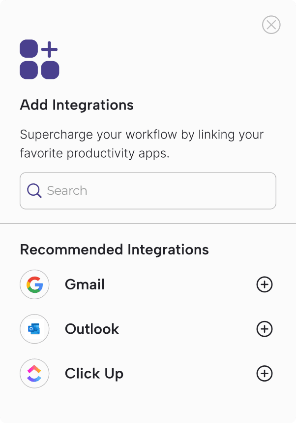
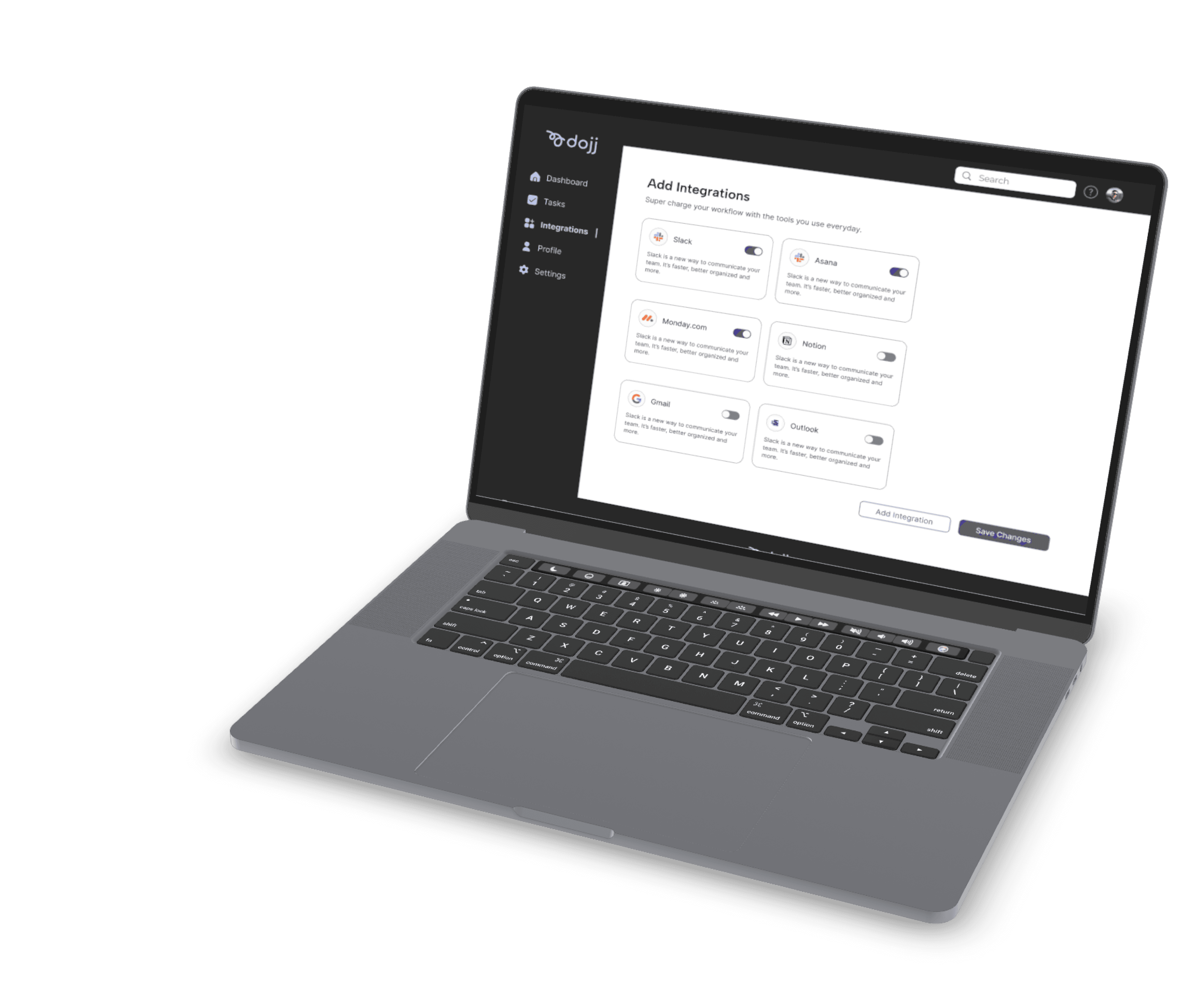
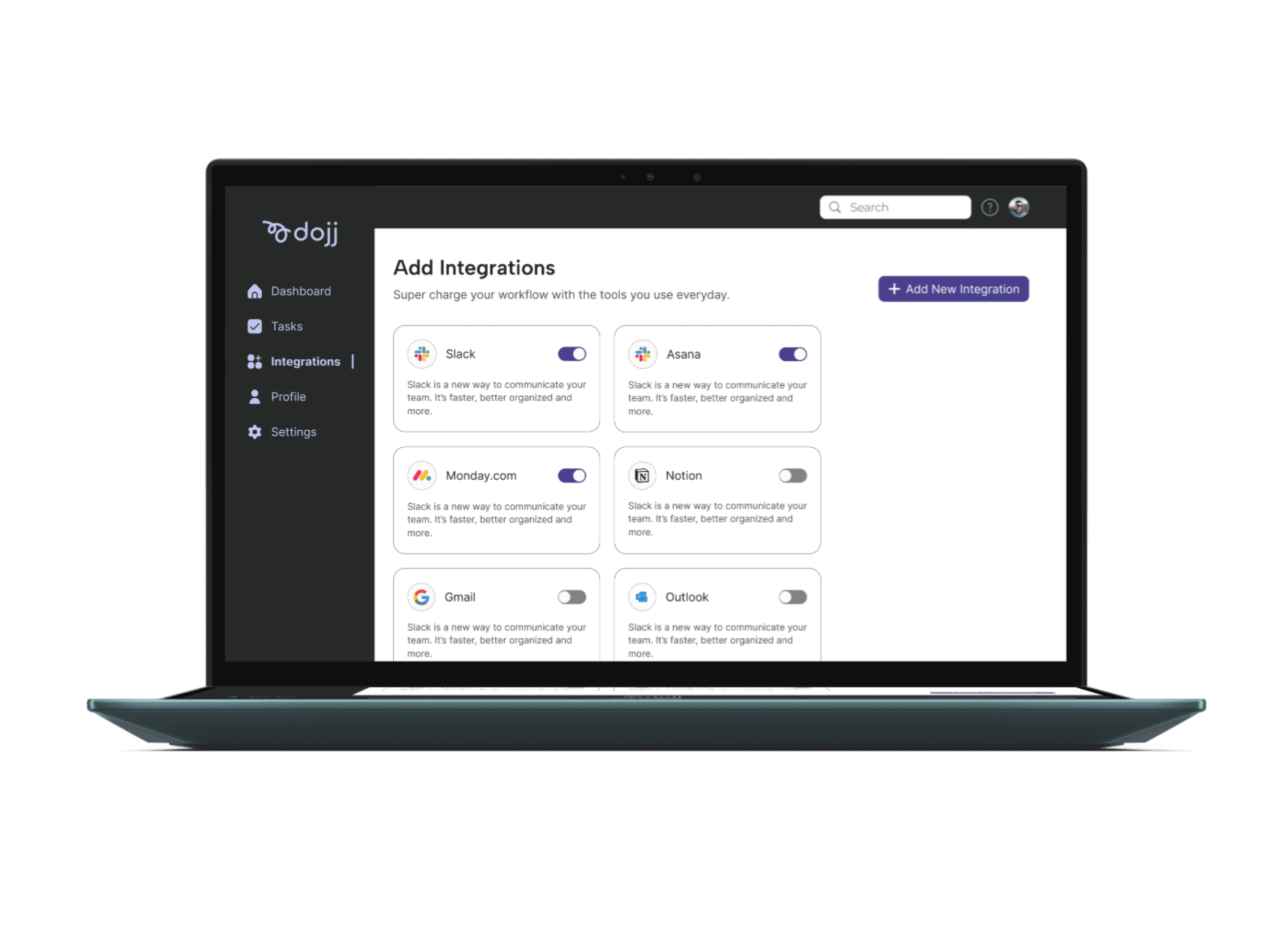
Adding instructions and the ease of toggling already integrated emails and messages.
Adding their information and redirecting them to their current Dojj Plan.
Prioritizing tasks that expresses urgency and incorporating color to enhance the visual organization and visual cues.
Dojj is an AI-powered, one-click solution for task management, dedicated to founders and team leaders.
Before
Before
Before
After
After
After
Stages of Journey
Activites
User Goals
Emotions
Potential Touchpoints
Opportunities
Awareness
To automate their tasks
Other
User searches for app
User searches for app
Purchase
Get the App
Website, App Store
Find app and purchases
Find app and purchases
Use
Easily see all tasks
Easily see all tasks
Uses the task dashboard
Uses the task dashboard
Review
Rate the App
Rate the App
Write a review for app
Write a review for app
Integrate
Wants an easy setup
App Screens
Connect the app to email
Connect the app to email
Inter
ABCDEFGHIJKLMNOP
QRSTUVWXYZ
abcdefghijklmnop
qrstuvwzxyz
Primary Purple
#1D1D1D
#4F4F4F
#BDBDBD
#E0E0E0
#FBFBFB
#E3E5FA
#C5C9F4
#4C408E
Background
Secondary Purple
Light Purple
Project Improvements
Looking ahead, I’d love to expand the style guide to make the design more cohesive and accessible, with updates like a better color palette and improved components, such as buttons, cards, and toggles. Spending more time on in-depth research and working closely with the client would help create designs that are not only visually appealing but also follow industry best practices while improving user workflows. I’d also focus on making user flows smoother and navigation more intuitive. On top of that, clearer documentation would make developer handoffs easier and keep everything running smoothly.
REFLECTIONS





Add integration with ease with a click of a toggle
Get more with your profile with all your essential information
REDESIGN
REDESIGN
REDESIGN

Alex Carter
